What Google Fiber Can Teach You About Better Presentations
Have you ever looked at a beautiful website and thought: I wish my presentations looked that professional?
You probably haven’t.
Well, here’s the deal, you should.
Clarity and persuasion are the same regardless of the medium: The audience is at point A, you need to move them to point B. That’s your job.

Does the landing page for your app ask people to submit their email? Well, they haven’t submitted yet, so they’re at point A. Move them to point B.
You’re selling $200 t-shirts on your niche e-commerce site? Before they buy, they’re at point A. You have to move them to point B.
The investor agreed to take a meeting and now you’re starting your pitch? She hasn’t invested yet, so she’s at point A. You have to move her to Point B.
The audience at a conference, your bosses in a meeting, the hot chick at the bar, they’re all at Point A. You have to move them to Point B.
Websites versus PowerPoint: Why Does One Suck So Bad?
But I noticed something strikingly different in websites vs. PowerPoint: People and companies go to great lengths to make their websites absolutely stunning, while their presentations are just slapped together, random, boring, and confusing.
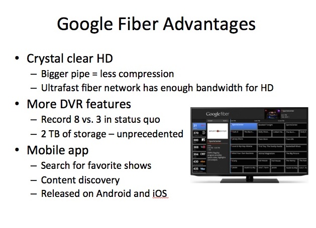
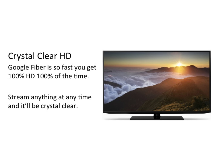
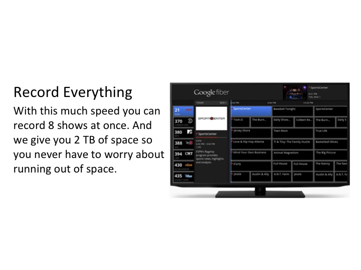
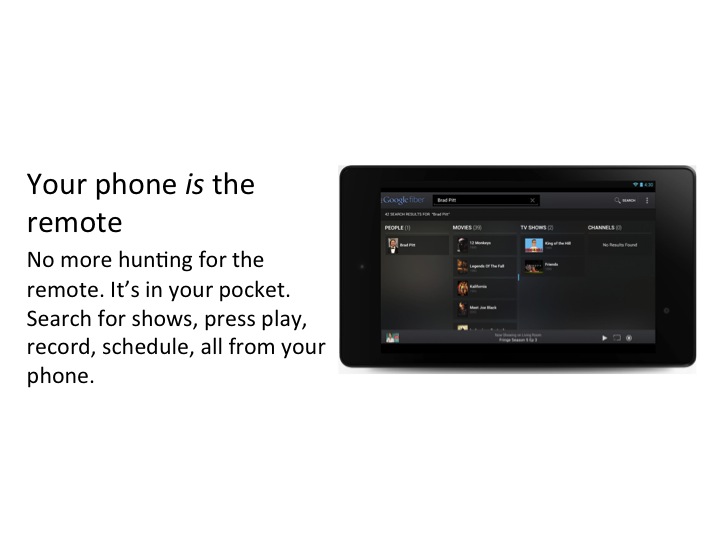
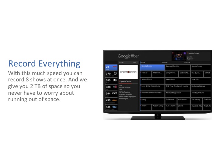
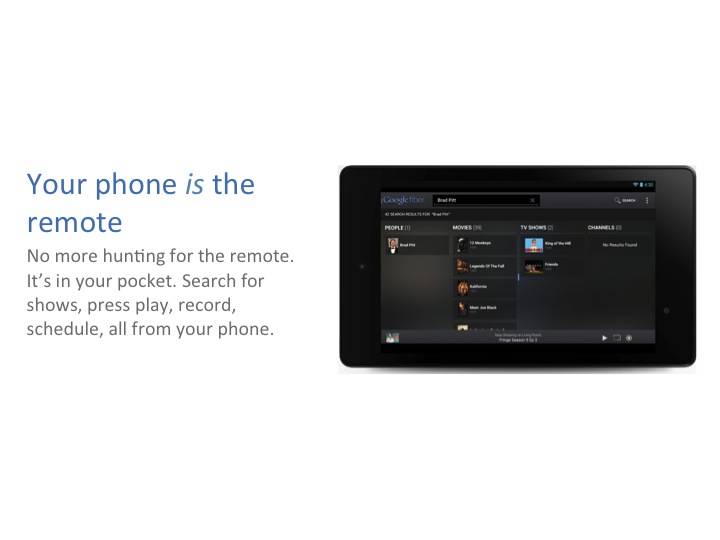
For example, check out how Google fiber walks through their advantages:
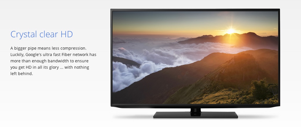
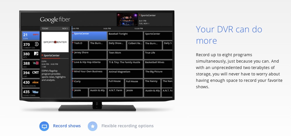
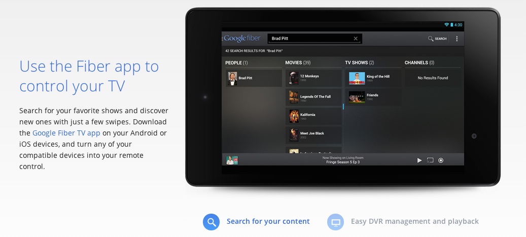
It’s literally equivalent to walking through 3 PowerPoint slides. But they’re clear and compelling.
If some corporate worker was asked to explain these same benefits in a PowerPoint, would it look this good and be this easy to understand?
HELL NO.
It’d probably look like this:
I know what you’re thinking: “But Devesh, it’s not fair, the site was done by a professional designer, how am I supposed to make every slide look that good? I don’t have that kind of time.”
And that’s true, it was designed by a professional. But it’s not about the fancy fonts, fancy colors, fancy patterns, or anything else.
You don’t have to use photoshop to make your presentations better. Below I show how you can take this slapped together slide and make it (almost) as good as the website with just basic PowerPoint defaults. In fact, look at the Fiber snippets, they use a basic font, two colors, and one photo per “slide”. No fancy pattern, no fancy font.
What makes the site better than my example slide are a few basic principles of communicating well (and thus persuasion):
- One idea at a time.
- Relatable language
- (minor) Visual Heirarchy
Let me give an example of each one and show how we can turn the above crappy slide into something more like Google’s page without any fancy fonts or backgrounds.
Rule #1: One idea at a time
I’ve talked about this at length before: separating your ideas into separate slides is the single biggest thing you can do to make your presentations more clear.
Chances are you too have too much stuff on each slide of your presentations and the audience is checking out because of it.
This is true beyond presentations. Think about really crappy websites: They have so much crap on them you don’t even know what to do. Or what if a salesman walked up to you and started spewing everything he knew at a 100 miles an hour. You would turn around and leave.
People need time and space to digest information. Give that to them. It will help them get to Point B.
Here’s the above slide turned into 3 slides with nothing else done to it. Note how just this simple change also gives me space to put all 3 photos back in.
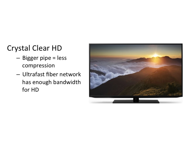
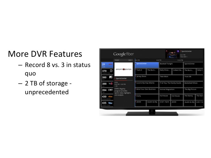
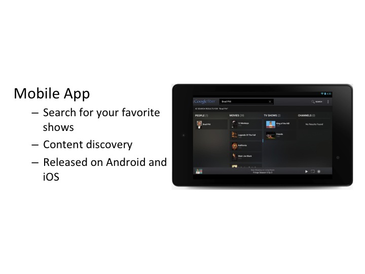
Already we’re making progress. On each slide you and the audience and focus on that particular feature. Feel how the meeting would go with this set of 3 slides instead of the first one. You and the audience focus on each feature together, without their eyes jumping all over the place. You can point to a separate image for each point, helping them believe you and slowly move themselves to Point B.
Slowly we;re turning a presentation into a conversation.
But we can do even better.
Rule #2: Relatable Language
Say you’re going to buy a dishwasher and the salesperson at one store says “You have to see this one! It’s got a vortex motor, titanium coated hydraulics and a dual thrust, high pressure nozzle system.” Then you go into another store and that salesperson says “Yeah you don’t have to pre-rinse anything with this one, just throw it in and it’ll clean it.”
Which one are you going to buy from?!
People trust people that they relate to. When you have language or copy that’s abbreviated, jargony, and written for a computer, you’re just stabbing yourself in the back for no reason.
Say things exactly how your audience would say them and you’ll see heads nodding.
Here are the slides with better language (Google’s language wasn’t bad, but I’ve taken it a step further):
Rule #3: Visual Heirarchy
This is the only “designy” rule of the three, but it’s powerful and easy to implement.
You have to guide the viewer through your slide visually. So in this case, the headline and the body text are too similar looking. The headline isn’t forceful enough in saying “I’m the leader. Start with me and then read the rest for more detail.” They blend together and our eyes jump between them. We can just change the color and font sizes to make the headline pop more:
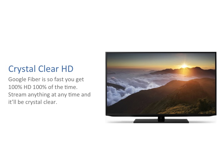
That’s it. Scroll back up and look at that first slide to remind yourself of where we started.
And note we didn’t have to download special fonts or use fancy patterns or gradients. In fact, even the blue and grey were from PowerPoint’s default color scheme. Default font, default colors and a dramatically more effective end product.
So the next time you think “I don’t have time to make my slides look good.” Think of these basic principles: 1) One idea at a time. 2) Relatable language. 3) Visual Hierarchy.
Want to see more before and after examples? Download them below.