

One powerful technique to make your presentations better – without spending hours reading graphic design books
Have you ever decided to read up on making better presentations because you wanted to look like a badass presenter at work or in conferences or pitching your company?
You’ve probably stumbled into the same few books and experts as everyone else: Nancy Duarte, Garr Reynolds, Guy Kawasaki, etc. Or maybe you ran across the thousands of articles or blogs that cite their advice.
What usually happens after you read the books is: you look at their gorgeous slides, try to imitate one or two for a presentation you have to give, realize yours don’t look as badass as their slides, realize that you’ve just spent a couple hours on a couple slides and if you did this for your whole presentation, it would take way too long, you give up and the book sits on a shelf and you go back to making mediocre to shitty presentations. It’s depressing. But it happens to so many people!
It doesn’t have to be like that. It’s possible to make much better presentations than your peers without being a graphic design expert.
Don’t get me wrong, the presentations and advice of these top experts are spot on. As a professional presentation designer, I’ve implemented these tried and true principles in presentation after presentation, and my clients and their audience love it.
But here’s the thing, for typical office workers, a lot of this advice just doesn’t work.
Why?
These presentation designers are heavy hitters, they design really important presentations and charge enormous sums for it — TED talks, huge conference keynotes, presentations Al Gore gives on Oprah. You know, the kind of presentations most of us NEVER give.
Here’s the thing: The content and style of these presentations are fundamentally different than typical office presentations.
Every try to present slides like those in your monthly update to your management team at work? Of course not, you’d like a weirdo.
You now the slides I’m talking about: One full bleed photo with an vague reference to some abstract concept and three words in some carefully chosen white space. Like this:
(Side note: Does anyone else’s eye keep going to that little spot of dirt on the side of the roll right below the cardboard shell? Gross.)Look, this slide is great in Merlin Mann’s talk. I’m not trying to diss.
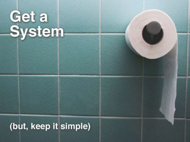
But are you going to put a slide of toilet paper up while giving your quarterly update? Or when trying to convince a client to hire your firm? Or at a board meeting? Please. Maybe some of you, but not most people.You have some hardcore data to present. I get it. You’re not going to have slide after slide of full bleed photos and a few words. Plus, you don’t have the time to be browsing for sexy new fonts and you’re not going to spend money on a stock photo even if it was appropriate. And overall, your presentation can’t look like this because it’s not a Ted Talk. I get it.
BUT…
This also doesn’t mean you have to be satisfied with slides that look like this:
This slide is begging for an audience member to slowly slip their iPhone out of their pocket, put it on their thigh, unlock it with the fingerprint sensor while looking up at you and pretending to listen, then start looking down and checking email.Let’s break this down.What you want:
- You want to impress your prospects
- You want to land that client.
- You want to impress your boss and management
- You want to get noticed at work
What you don’t want:
- You don’t want to go get a graphics design degree.
- You don’t want to read 4 books on graphic design.
- You don’t want to buy Photoshop.
- You don’t want to spend money on stock photos or fancy fonts.
- You don’t want to look like a weirdo in front of your coworkers when you put up a slide that looks like you’re giving a TED talk at work.
I get it.
What do most people do when they reach this predicament?
Nothing. They end up doing nothing to give better presentations. They think “Oh well. If I ever need to give a TED talk, I could use this advice one day” or “I guess this is why presentations at work look like they do. The amount of information we’re presenting means it has to look cluttered”. And you go back to doing things the way you always have.
Is this the only way? No.
Is there no hope of making run of the mill work presentations look awesome so you can raise funding, land clients, or get noticed and promoted at work?
Please, why would I be writing this post if there was no hope?
There is a way to improve your day-to-day presentation skills with simple, actionable tactics and strategies that won’t make you look like a Ted Talk poser at work or in business meetings.
It’s not hard, and you can look like a badass without spending hours on Flickr looking for artsy photos or limiting your slides to 3 words (sometimes you need to put text up there!).
I’ll be covering a lot of these strategies regularly on this blog, starting with one of the simplest ones below. So if you want to improve your communication skills and look awesome in front of your boss or clients without looking like a weirdo giving a wannabe Ted Talk at 2pm on a Tuesday at work, you can sign up below to get regular updates from me.
The If you doubt it, Split It Technique
There are many techniques that you can use to improve your work presentations that that I’ll cover, but for now, let’s not try to change too much behavior at once. We need to focus on one bad behavior and counter it with an easy, frictionless technique that is super powerful for making presentations better.
Let’s focus on the amount of content on a slide.
Getting this right is the difference between a crisp slide that supports you and cluttery nonsense that makes you look like everyone else. You don’t want to look like everyone else, you want to look better.
Most advice on this topic says: One idea per slide!
Look, one idea per slide is a good motto and many people tout it. For a Ted Talk, sure. For a keynote, sure. But you’re not Steve Jobs.
If most technical employees (or other employees) put only one idea in a slide, we’d be in meetings for EVEN LONGER than we already are and we’d be on PowerPoint all day making 200 slide decks, and then we’d go home and resort to heavy narcotics to dull the pain.
You don’t need to resort to narcotics. You are better than narcotics.
At the same time, slides like the one above don’t really make you look like a top performer. You look like every other employee looking for a raise, or every other consulting firm looking for business, or every other startup looking for money.
But you don’t want that. You want to look like a badass.
And you want to persuade people. So you have to keep your audience engaged, hanging on to every word you’re thinking, and when you click to the next slide you want them to think “Damn, this is a real professional, they know what they’re doing. This person is not like everyone else.”
Just being aware of too much info on slides good as a first step, but we need an easy, actionable habit we can build that you’ll actually remember to use.
The Amount-of-Content Solution
The solution comes from doubt. Yes, that feeling of doubt. Doubt that your presentation isn’t quite good enough. Doubt that this one slide looks a little too crappy.
All you have to do for now is this: the next time you’re making a presentation for work or a client and you stop and think, man, I think this slide looks shitty but I need to present all this info, what do I do?
Do this: take one concept from the slide and split it into its own slide. That’s it, just start there and watch how that improves your presentation.
If you doubt it, then split it.
You don’t have to get an account with istockphoto. You don’t have to read 5 books on whitespace. You don’t have to download fonts.
All you have to do is wait for that feeling of doubt. When you feel doubt, split it. Split something from your cluttered slide out into its own slide.
Start with this and your presentations will start to look better than everyone else’s. You will start to get noticed.
An Example
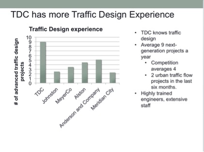
Let’s see how you do this with the above slide touting your traffic design consulting company, TDC. You feel uneasy that this slide isn’t compelling enough but you want to present all that info so your client knows you’re awesome (or your boss requires it). But you don’t want to find some artsy photo on flickr and you’re short on time. What do you do? Just split it.
Pick one of the biggest concepts and give it its own slide. In this case, the graph is compelling but its power gets lost in this slide. Splitting it into its own slide is an easy way to make this idea be memorable:

By splitting this slide, you can focus in on what is most essential in the bullet points on the original. In this case, most of it was just reiterating what the graph showed anyways: TDC has more project experience than other firms.Likely what you’ll want your second slide to be is a team slide since that will highlight the great personnel that your firm has.The graph by itself in a single slide is not only visually clean, but it shows instantly what you’re trying to get across, and it allows you to keep it up in the background while you explain more about how TDC is the best design firm.Lastly, remember that the first part of the technique’s title is also important: “When in doubt”. If there are slides that you aren’t doubting, then move on. This is key to changing your presentation building behavior. If you feel like you need to change every slide of every presentation, you’ll get overwhelmed and give up.
Just wait till you reach a slide and thing “Man, this one is especially shitty. And it’s really important, so I want it to look better.” Now just pick one of the key concepts from this shitty slide and split it off into its own slide.
If you doubt it, then split it.
2 Comments
Quora
February 25, 2014How do I make PowerPoint slides look elegant and designy?
You can easily get overwhelmed with different things you could do to make it designy. Don’t try to do everything at first, just focus on the most important things. In my experience, the single most important thing is to separate ideas into separate sl…
Devesh Design » Stop wasting time with PowerPoint and make your presentation more awesome at the same time
March 7, 2014[…] I talked about my When in Doubt, Split It technique to make presentations better without having to go back to school and get a graphic […]