

Stop wasting time with PowerPoint and make your presentation more awesome at the same time
One thing about working with startup founders is that they love to talk about how busy they are. Hell, you’re probably reading this right now and thinking “Man I’m so busy.” Yeah, ok.
But if you’ve made it this far, keep reading because I’m about to save you time (from editing slides on PowerPoint no less), and make your investor pitch, conference presentation, board slides, or whatever a lot better.
Recently I talked about my When in Doubt, Split It technique to make presentations better without having to go back to school and get a graphic design degree or read 15 books on hard edges and color theory.
There’s an added benefit to splitting important concepts out into separate slides beyond the fact that your message is clearer: It saves time when editing presentations later.
The Problem
Here’s why: When a slide is jam packed, there’s not a lot of room for anything to change. Take this slide “Competition” slide from an imaginary daily deals startup, Devesh’s Deals:
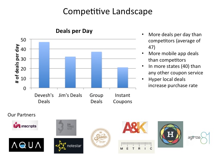
Now imagine an extremely typical scenario for startups: I present this to a couple of investors and they both ask me not about the number of deals we do per day, but instead of average number of buyers in each deal.
Now I’m scrambling like a chicken with his head cut off to add this information before my next pitch.
In this scenario, here is the most common thought process of the founder/CEO:
- Well, this is our (single) competitors slide
- Investors want more info about competitors
- Therefore we have to add said info to this slide
So this happens:
Great. Now you’re well on your way to an investor presentation where each slide is:
- So jam packed with information that the investor has no idea what to focus on. (So they’ll focus on their phone instead)
- Looks awful (which reduces credibility and makes it hard to understand your key points).
- Is not memorable.
“Is not memorable” is key. Put yourself in the shoes of an investor. You get hundreds of pitches sent to you a month (maybe more). You meet countless entrepreneurs and have several meetings weekly and monthly where they are all saying the same thing: “We’re unique!” “our market is huge!” “Our team is spectacular!” “We’re experiencing tremendous growth!” “Our retention is great!” “We only need to raise one more round!”.
You want them to remember you. How the hell are they going to remember anything if your slides are so jam packed that you don’t even know what to focus on?
You know what this is equivalent to? It’s like asking a user to click on your “sign up” button on a web page that looks like this:
(Thank You: http://www.goatkarma.com/2009/04/gloriously-bad-websites-a-celebration/)
And on top of all of that, dear entrepreneur that “has no time”, look what you had to do to make this change: You had to edit an already existing slide:
- You had to move things around
- You had to change font sizes
- You had to adjust logo sizes
- You had to THINK
And I know how the startup fundraising cycle works. Every investor has one more comment, which is one more thing you have to change. And pretty soon your full time job is tweaking your pitch. Let me repeat that: And pretty soon your full time job is tweaking your pitch.
Why are you wasting your brain power on deciding what the layout of a slide is over and over again (instead of only the first time)? When you’re doing this, you are:
- NOT spending time validating your business model with customers
- NOT spending time improving your product
- NOT spending time recruiting top tier talent to join you on your mission
- NOT spending time watching House of Cards with your special someone
Basically everyone I meet says they hate fiddling with PowerPoint. And yet, they’re insistence on cramming multiple ideas into slides makes it worse. If a slide is jam packed like a packed fridge, changing anything means you have to keep re-arranging things to make new things fit.
And guess what? Changing slides happens daily for startups.
The Solution
If you conscientiously use the When in Doubt, Split It technique, you would take the three sections of the initial slide and split them up into three slides like this (and to give it some continuity, you can just add a “section header” slide):

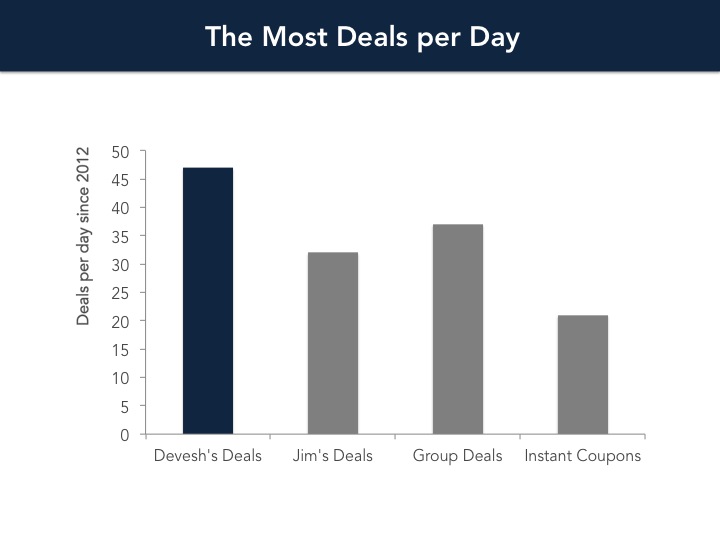
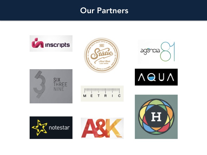
So first of all, this makes each individual idea stand out, be far clearer so people actually understand what the hell you’re trying to say, and be far more memorable. Each graph stands on it’s own. You can give partners more respect by blowing up their logos, talking about them, and spacing it out cleanly. You can use your (repetitive) text as a summary and have space to really focus on them and even add icons to make it more memorable. But I’ve already discussed those advantages in a previous post.
Here I want to show how damn easy it is to edit slides now.
Now if we need to add a second graph of average number of buyers per slide, all we do is copy the first graph’s slide and throw in our desired graph (in this case, just edit the data!):

Boom!
Note what we’ve done here. We only have to think of the layout of the “graph” slide ONCE. That’s it. Then we just throw in graphs, one after another to our heart’s content and we never have to think about the style of those graphs again. (CSS anyone?)
This saves time and mental energy. You only have so much cognitive power, don’t spend it thinking about the style of your slides over and over and over again. Split your concepts up, save time editing, and make your pitch more memorable for the investor. Your life will be better.
If you like this post, get articles like this that make you a more badass presenter for free, delivered straight to your inbox:
1 Comment
Devesh Design » What Google Fiber Can Teach You About Better Presentations
July 17, 2014[…] I’ve talked about this at length before: separating your ideas into separate slides is the single biggest thing you can do to make your prese… […]